Brand background
Tea Ning手打柠檬茶创立于2023年,作为一家专注于柠檬茶的茶饮品牌,Tea Ning在传统柠檬茶的基础上进行了精致的改良,更加注重空间和社交体验,提供舒适的堂食环境。区别于常规柠檬茶店,Tea Ning以其独特的品牌理念和产品质量标准,致力于创造不平凡的消费体验。
在此次品牌重塑中,我们汲取航空飞行的灵感,将其转化为创新的设计元素,通过独特的视觉语言突破传统柠檬茶市场品牌形象的框架。TeaNing的设计不仅增强了市场的辨识度,还深入表达了品牌的核心理念——“打破常规,释放自我”。我们的目标是将Tea Ning塑造成为柠檬茶行业的领军品牌,具备无可比拟的品牌影响力和辨识度。
Founded in 2023, Tea Ning is a tea beverage brand specializing in lemon tea. Building on traditional lemon tea, Tea Ning has refined the product to focus more on space and social experiences, offering a comfortable dine-in environment. Unlike typical lemon tea shops, Tea Ning stands out with its unique brand philosophy and high product quality standards, committed to creating extraordinary consumer experiences.
In this brand revitalization, we have drawn inspiration from aviation, transforming it into innovative design elements. Through a unique visual language, we break the conventional image of lemon tea brands in the market. Tea Ning’s design not only enhances market recognition but also deeply conveys the core philosophy of the brand—'Break the norm, release yourself.' Our goal is to shape Tea Ning into a leading brand in the lemon tea industry, with unparalleled brand impact and recognition.


Design Philosophy
在调整品牌策略上,我们提出从街边的柠檬茶小店转型为一个精致而时尚的茶饮品牌,旨在提升消费者对TeaNing品牌的认知。这不仅是将柠檬茶定义为一个简单的饮品,而是塑造成一个深受喜爱的品牌,并将其视为整个茶饮市场中的重要一员。 我们将重塑品牌的视觉和功能性,保留原有的高效小店模式,同时去除在柠檬茶领域中常见的非独特印象,重新定义消费者心中的“精致时尚茶饮”品牌形象。
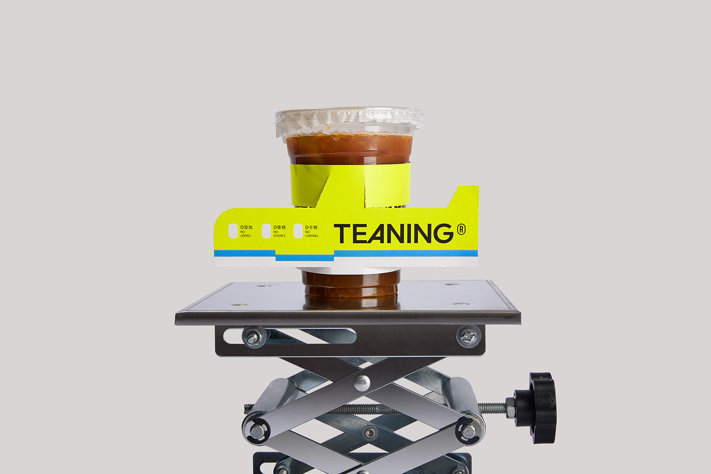
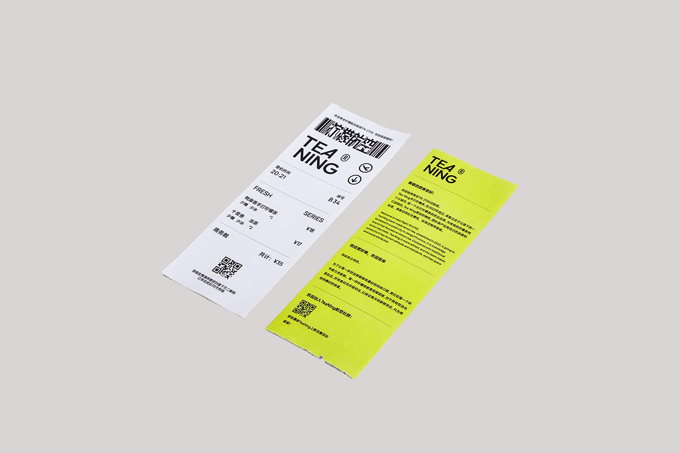
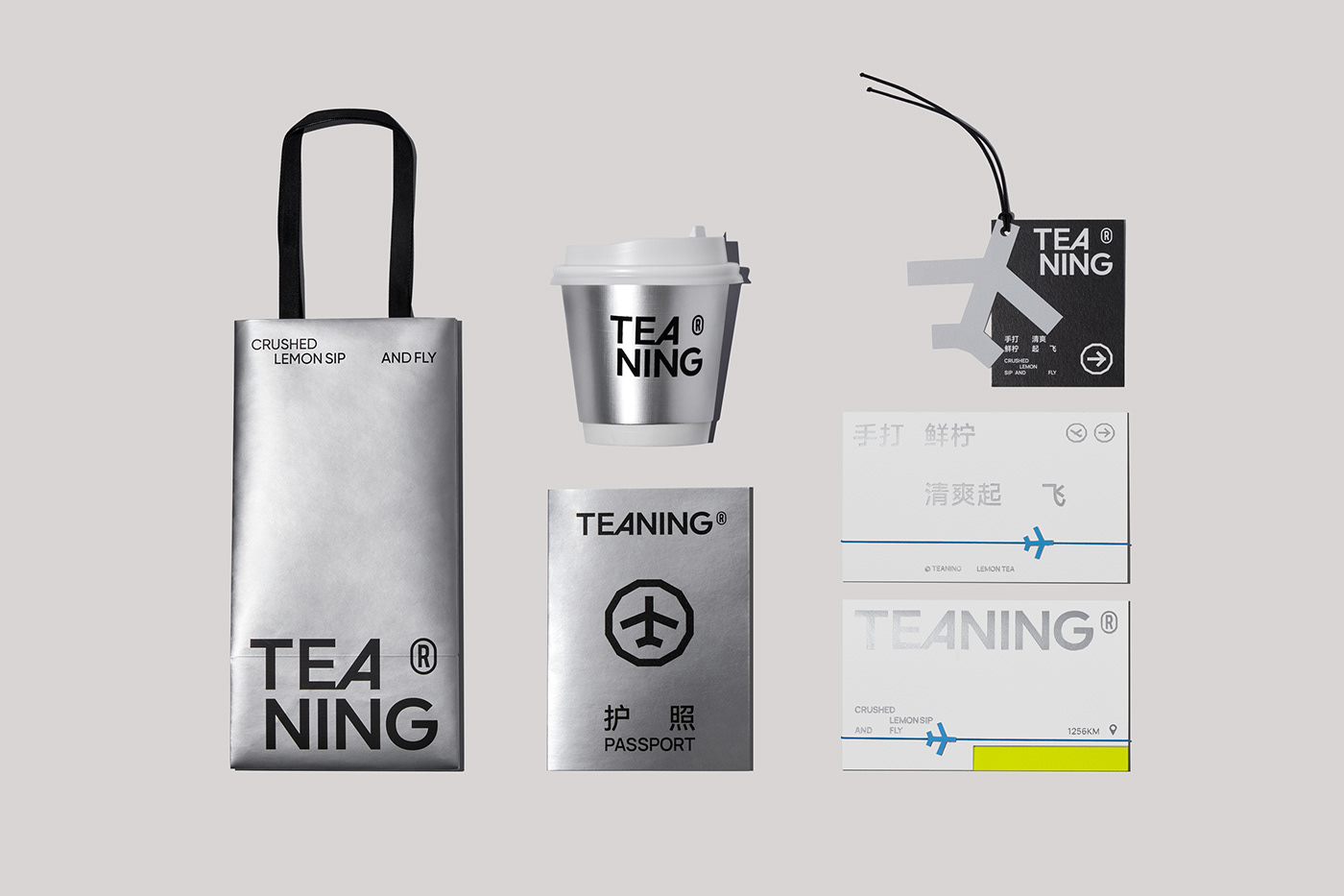
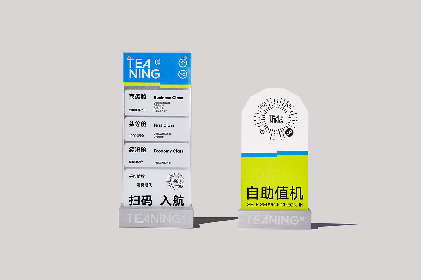
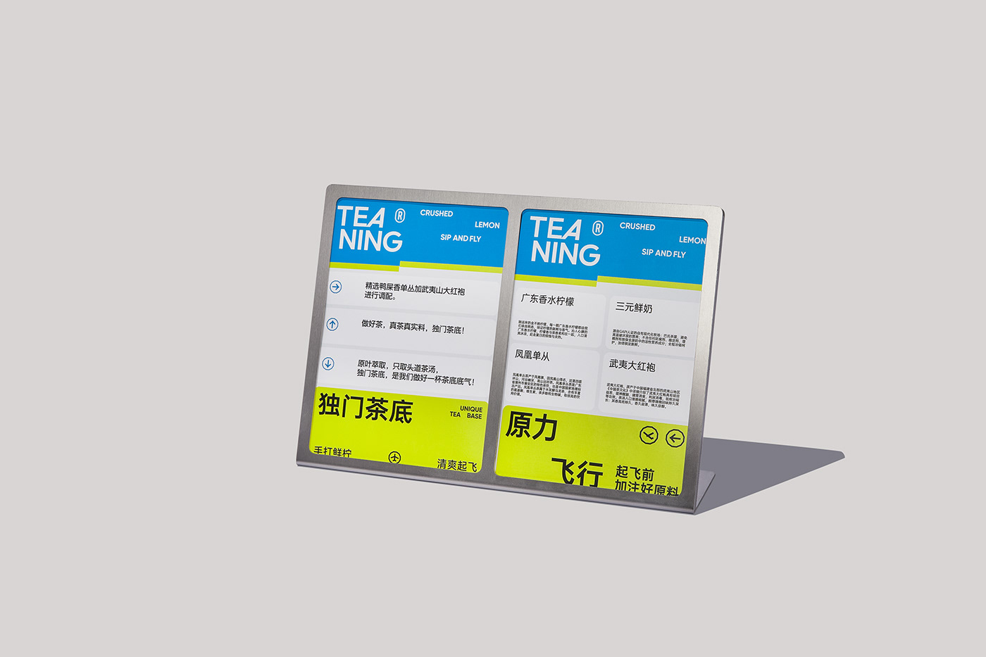
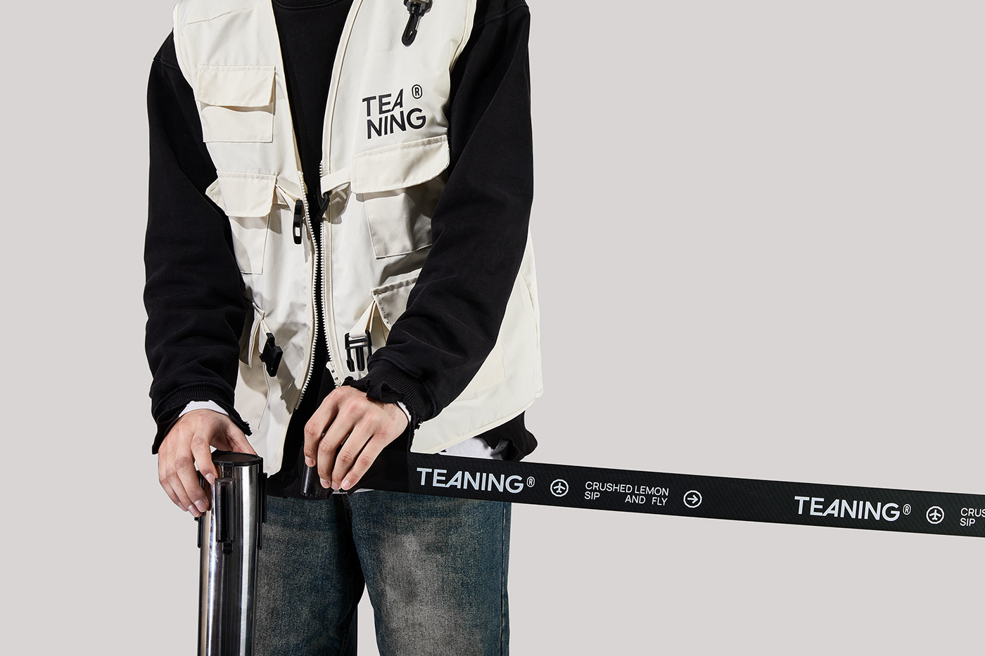
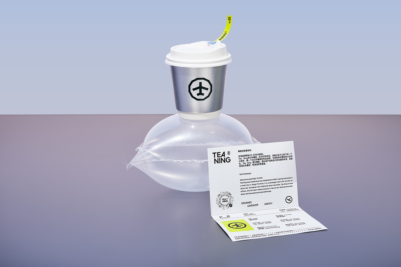
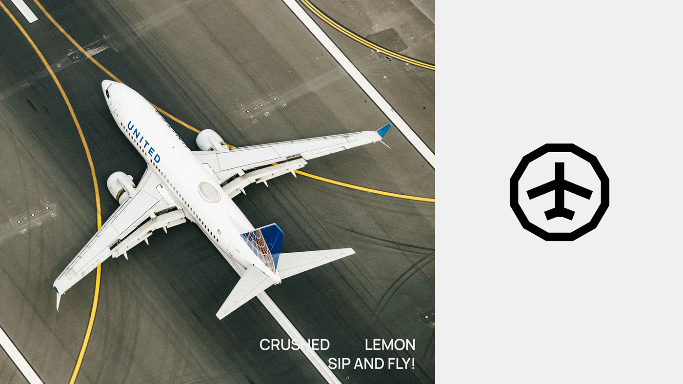
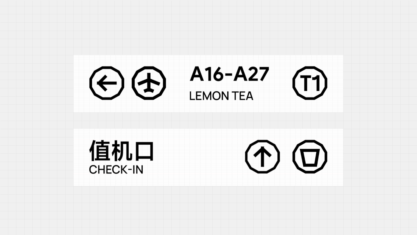
此外,我们特别关注如何巧妙地将航空元素融入品牌视觉,同时保持产品的高品质感受。 在视觉呈现方面,我们将航空主题作为设计核心,使用大众易于识别的“飞机”符号,并引入航站楼元素,如T1、T2、T3作为品牌延伸的图形符号,标明不同的产品线:柠檬、乳饮和咖啡。此外,我们借鉴飞机票(小票)、护照(会员卡)、值机处(点单处)、登机口(取单处)等具体元素,在品牌的平面设计和空间布局中得以体现。
我们还将飞行航线和高度的概念融入品牌设计,从而确保品牌形象的连贯性和趣味性。 通过这种方法,我们不仅增强了品牌的个性化表达,也极大提升了品牌在线上线下的传播效率,使品牌形象更加生动和记忆深刻。
In refining our brand strategy, we propose transforming from a streetside lemon tea stall into a sophisticated and stylish tea beverage brand, aimed at elevating consumer recognition of the TeaNing brand. This involves not merely defining lemon tea as a simple drink but shaping it into a beloved brand recognized as a significant player in the broader tea beverage market.
We are set to reshape the visual and functional aspects of the brand, maintaining the original efficient small-store model while discarding the generic impressions commonly associated with the lemon tea sector. We aim to redefine the 'sophisticated, stylish tea beverage' image in the consumers’ minds. Additionally, we focus on seamlessly integrating aviation elements into the brand visuals while maintaining the high quality of the products.
Visually, we center our design around an aviation theme, utilizing the widely recognizable 'airplane' symbol and incorporating elements of airport terminals, such as T1, T2, and T3, as graphic symbols that extend the brand identity to different product lines: lemon, dairy drinks, and coffee. Moreover, we draw inspiration from tangible elements like boarding passes (receipts), passports (membership cards), check-in counters (ordering points), and boarding gates (pickup points) in our brand’s graphic design and spatial layout. We also incorporate concepts of flight routes and altitudes into the brand design, ensuring cohesion and playfulness in the brand image.
Through this approach, we not only enhance the personalized expression of the brand but also significantly boost the efficiency of brand communication online and offline, making the brand image more vibrant and memorable.